Such architecture designed to detract vandalism and dangerous activity serves a positive purpose, but some think this poses a problem to society as a whole.
Our facilities services teams manage a wide array of different spaces, many of which include public plazas, passageways, lawns and other public access areas. Between stadiums, airports, medical buildings, historic buildings, college and university campuses, and many other unique corporate headquarters locations, our teams are the stewards of a variety of different spaces.
These and other public areas offer myriad locations to rest in—benches, picnic tables, bus shelters and the like. But these community spaces aren’t meant for certain behaviors such as sleeping, loitering and artistic expression (tagging, graffiti or other unsanctioned work).
For this, architects have come up with what is sometimes called hostile architecture or unpleasant design, says Roman Mars in his podcast 99% Invisible, which tells unconventional stories—stories about the things most people don’t think about. Say, for example, the largest bus station in Tel Aviv, the design of the San Francisco flag or the practice of publicizing missing children on milk cartons.
Kristen Young, onsite landscape project manager and certified arborist at a corporate campus in San Antonio that our C&W Services team oversees, finds that such architecture is unavoidable, but it should improve the look and feel of the area itself.
“As a landscape designer, my approach to design has always been for enhancement and beautification,” says Kristen. “So, of course, I find some of the architecture creative and necessary.”
In his July 5 posting, Mars spoke with Selena Savić, one of the authors of Unpleasant Design, a book that discusses hostile architecture. Examples they discuss include benches with armrests that prohibit lying down and the use of classical music outside of businesses to prevent kids from loitering. These ideas can be extremely helpful for facilities maintenance—less graffiti, trash and other messes make for easier cleanup up.
But Mars and Savić also explore the deeper concept of behavior control through design. Mars’ story is interesting in that it allows you to consider not just the practical side of this concept, but also the broader implications.
One infamous example is the Camden Bench, which is impenetrable to almost anything aside from sitting—there are no slots or crevices to store drugs; theft is difficult as recesses near the ground allow for bag storage behind the legs of those sitting on the bench; it has a special coating to prevent graffiti; and it’s almost impossible to sleep on.
But while many of these seem like a good idea, others believe it only addresses one part of a problem (sleeping outside in public) rather than the root of the problem itself (homelessness). For this, and other reasons, architects and business owners need to be aware of the positive effects, but also the negative outcomes that can arise from designing such public areas.
“For me, the most interesting point in the article is that designers are possibly moving the unwanted behavior away from certain areas and not helping to deal with the problem,” says Kristen. “Here on campus, we encourage a positive environment and outdoor interaction. So, most of the landscaping and hardscapes invite employees to dine, exercise and socialize.”
Our facility managers and teams, like Kristen—s, sometimes employ unpleasant design concepts or even fashion their own.
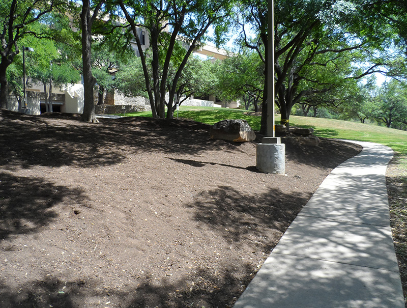
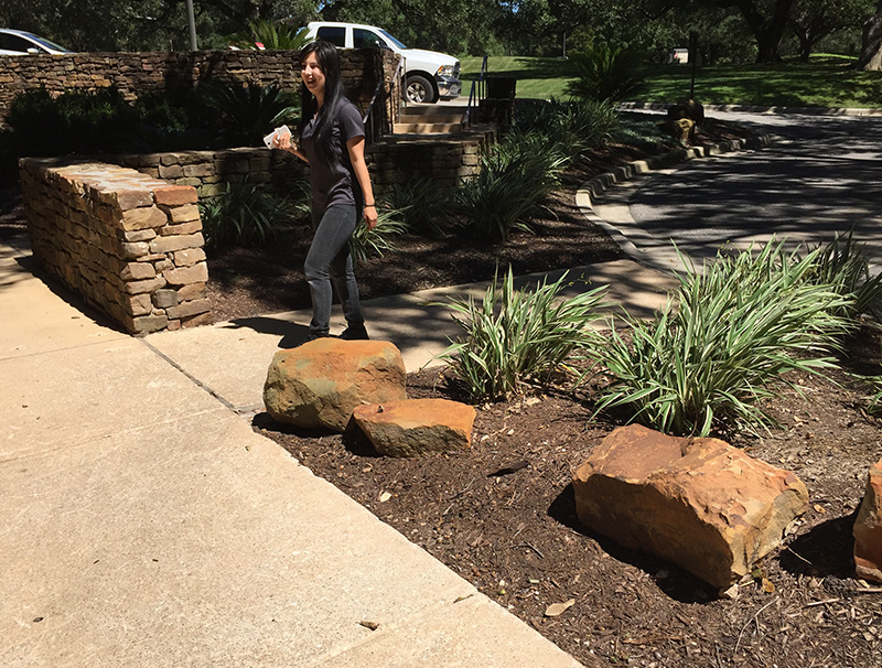
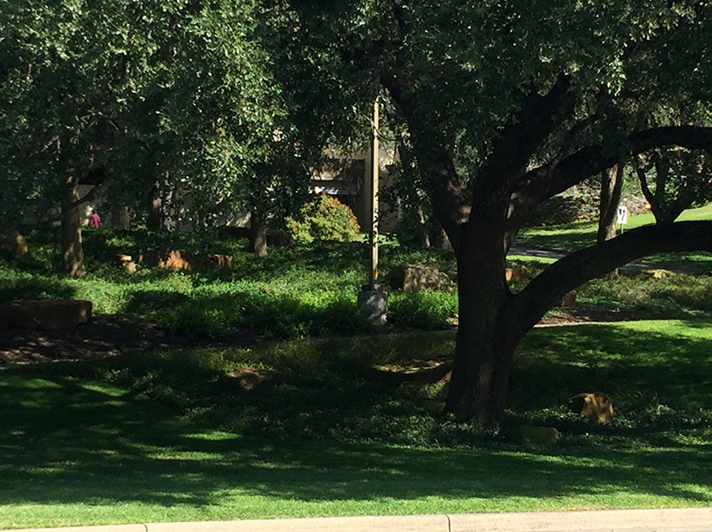
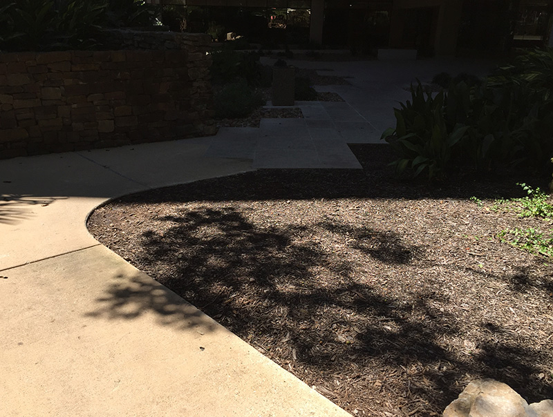
One way in which Kristen used this design style was to divert people from creating dirt pathways or cutting through the landscaping on campus. Such practices made the area undesirable because of mud, lack of vegetation and erosion. So, her team installed large boulders, berms and plantings to head people in the right direction.
“We took this as an opportunity to enhance the area,” says Kristen. “Some pedestrians aren’t happy about walking the intended route, but our client prefers more green spaces than hardscapes.”
This fall, Kristen’s team is working to decrease the amount of cigarette butts found in the landscape and on the street from those who smoke directly outside of the campus as the area is smoke free. Receptacles aren’t a solution due to location, fires and vandalism, so Kristen is removing a few of the open turf areas and creating planting beds where smokers tend to congregate.
The new planting beds will have crushed granite with small cigarette disposal areas created with sand. These are aesthetically pleasing, easier to clean and fireproof. Signs will be placed in the beds with information on how C&W Services will recycle the cigarettes and describe the benefits of such a program.
Projects such as these help remove problems within the client site and improve it aesthetically. Our employees across the country solve issues like these every day in creative and vital ways.


